Case Study: Making ALAMI’s Calendar More Accessible for Funders
- Pratiwi Nur Amini
- May 4
- 4 min read

Updated: Jun 4
🤔 a little back story and the problem:
ALAMI P2P's mobile app includes a calendar feature designed to help users/funders distinguish between key activities, such as funding, disbursement, and repayment, by assigning each a unique color. This feature allows users to track the status and timing of their financial activities at a glance.
However, during a routine meeting in Q2 2022, our Customer Success Management (CSM) team received feedback from a funder who was struggling to differentiate the calendar’s color-coded indicators. The funder has total color blindness (Achromatopsia), a condition in which vision is limited to black, white, and shades of gray.
Further investigation revealed that the color palette used in the calendar was not optimized for users with Achromatopsia, resulting in indistinguishable colors for funding, disbursement, and repayment dates. As a result, affected users faced significant challenges in understanding and managing their financial activities within the app.
My Role | Product designer (conception, visualization, interaction, UX and UI Design, Testing, Prototyping) |
Team mates | Mahardhika Sulistyo (Direct Lead), Sukmayanti (PM), Nurhadi Wibowo (Mobile Engineer) and others |
Key Expert/Stakeholder | ALAMI P2P apps users and CSM Team |
Dates | August 2022 |
Sector | Financial Technology, Inclusivity |
🎯 Goals:
To enhance accessibility for individuals with visual impairments. We didn't limit our efforts to addressing the needs of those with Achromatopsia. We also took into consideration the challenges faced by individuals who have difficulty distinguishing shades of other colors, like red and green, or blue and yellow. By doing so, we hope to contribute to inclusivity by avoiding color combinations that are unfriendly to people with visual impairments.
🧑🎨 Design Process:
First, I tested the current calendar section using a vision simulator to mimic how it would appear to individuals with Achromatopsia. For this, I used Stark. The results are as follows:

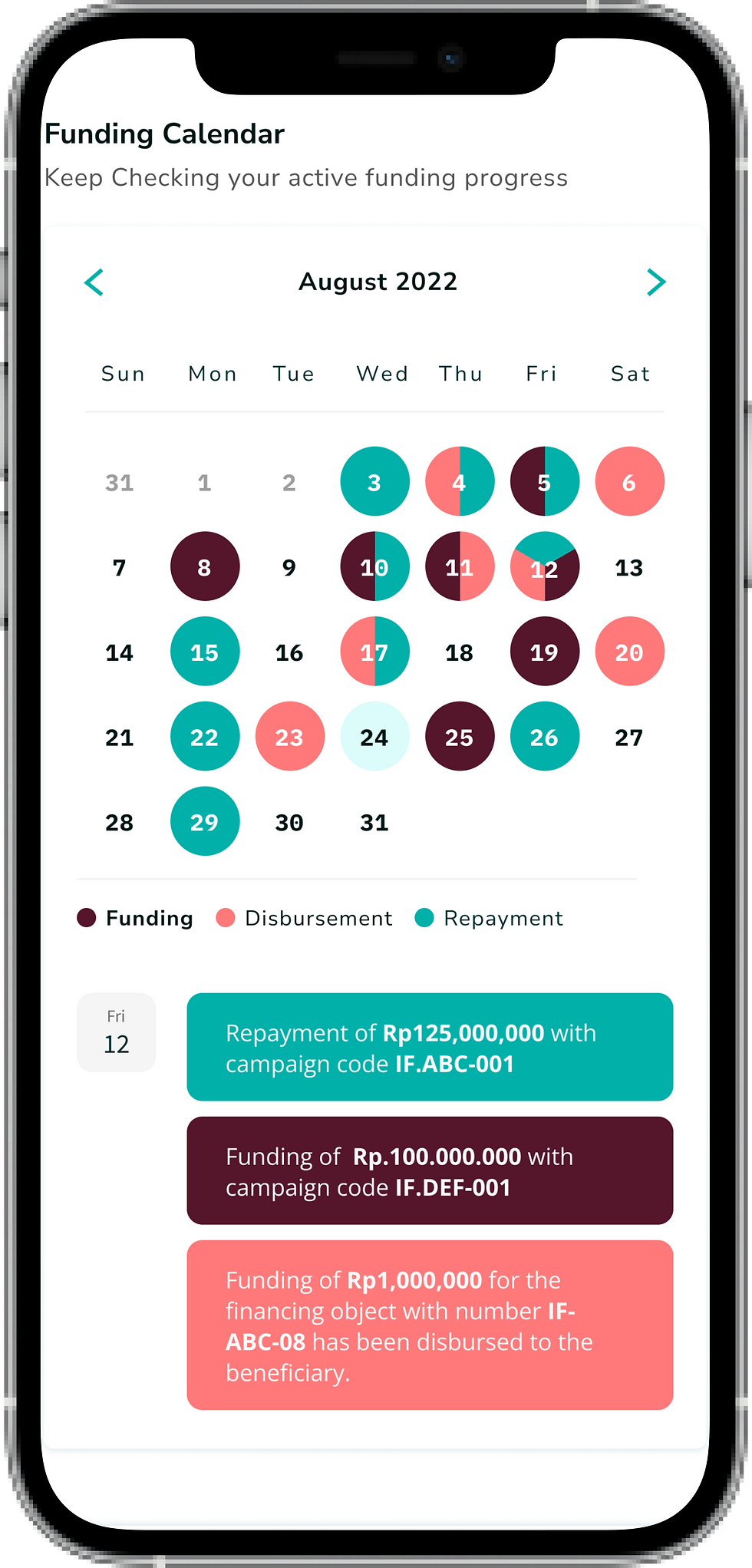
In the calendar feature, three main events help track key funding activities for funders and beneficiaries:
Funding: The point at which a funder supports a campaign or project, marked with the color #839DFE (Periwinkle Blue).
Disbursement: When the funds from a fully funded campaign are distributed to the beneficiary, represented by #66DCEC (Turquoise Blue).
Repayment: When the beneficiary repays the disbursed funds based on the agreed-upon tenor, and funders receive their returns. This is shown in #4F9DE1 (Celestial Blue).
What I failed to consider was that the combination of these colors could be difficult to distinguish for users with visual impairments, particularly those with partial or total color blindness (Achromatopsia). This issue is especially pronounced for critical events like Funding and Repayment, which are both represented by dark shades of blue that are challenging to differentiate.
Additionally, given that our user base primarily consists of men, a demographic statistically more likely to experience color vision deficiency, this problem likely affects more than just a single user. We unintentionally created an accessibility barrier that could hinder many of our funders from effectively navigating the platform. Sorry funders 😔
What Next?
After gathering this information, I began exploring new color combinations within the design system and discussed possible solutions with the interaction designer. I realized that the spectrum of visual impairment is not limited to black-and-white vision, there are also conditions like Protanopia (inability to distinguish red) and Deuteranopia (insensitivity to green, causing confusion between greens, reds, and yellows) and so on. I factored these constraints into the new color choices, ensuring that I avoided problematic pairings that could cause similar issues in the future.
At the same time, I made sure to align the updated colors with our brand guidelines and design system. After careful consideration, I finalized the new color palette:
The colors must be tested for various scenarios, such as cases where two or even three events occur on the same date. For example, Funding and Disbursement often happen on the same day, as projects are typically disbursed to beneficiaries several hours after funders chip in.
It’s important to visualize how these overlapping events would appear on the calendar. To account for this, I ran these edge cases in the simulator. Here’s what it looks like:

here what its look like as a whole:


I also ran simulations for other visual impairment spectrums:

✨ Result
After the feature launch, there were no further complaints of this kind, as noted in the CSM team’s report. Looks like we nailed it!
Even better, the feature was recognized by leadership for its dedication to inclusivity, especially in supporting funders with visual impairments. A small step for accessibility, a big win for our users,
Horray 🎉!
💬 Reflections:
This project was a meaningful learning experience for me, both professionally and personally. When ALAMI’s app first launched in 2019, accessibility wasn’t something we actively considered. In fact, I wasn’t even fully aware of how critical it was. Our UX team was still in its early stages, and the P2P team consisted of just me and my leader. We didn’t yet have the maturity or perspective to recognize the level of inclusivity we owed to our funders.
Looking back, I’m almost grateful for the complaint we received. If it hadn’t been raised, I might never have considered the accessibility challenges our users face. This project was a powerful reminder that even small feedback can lead to big improvements, especially when it comes to creating a more inclusive product for everyone.


Comments